Three AI engines.
Three separate homes.
I'd already picked up and revamped each engine on its own — Natural Language Query, the automated Insights, the ML workflow — each in its own menu, each barely found. IQ is the culmination: the three I owned, brought into one home. One dataset, one mental model, one place for intelligence that already existed. I aligned four PMs and 30+ engineers who didn't report to me, and after half the design team was cut, I managed more than 50% of the platform's UX architecture.
- Scope
- 3 AI engines, each revamped first
- Architecture
- 3 → 1 · three menus, one hub
- Status
- Design done
V4, walking — the built IQ Plugin.
Powerful. Paid for. Impossible to find.
Leadership read the low numbers as a model problem, sure the forecasts weren't good enough. The truth was simpler: the AI worked. People just couldn't find it. I seized the opportunity during product-consolidation talks: I designed dozens of concept mockups, ran three to four meetings a week across timezones, and pitched the vision. My work drove the concept; I got the VP's approval and owned it end to end.
The engines weren't the problem. Their addresses were.
Nothing here needed to be invented twice — a designer before me had built each engine's first UX, and I'd picked each one up and revamped it, one at a time. The ML workflow inside the Reporting Server: the Predict Data landing, the train-model wizard, the confusion matrix. Natural Language Query and automated Insights, each in its own menu. Powerful engineering, sitting at low adoption because it was essentially invisible to the users who needed it most.
The problem was the addresses. NLQ and Insights were buried several clicks deep, then inside the Explore Data popup. ML was reached by right-clicking a dataset — an entry I'd added when I revamped ML; before that, it was hidden inside Reporting Server. Two paths, two mental models — no wonder nobody found them. Leadership read the low numbers as a model problem, sure the forecasts weren't good enough. The truth was simpler: the AI worked. People just couldn't find it.
So IQ was never about building the intelligence — it already existed, and I'd already revamped it. It was about giving the three engines I owned one home. I seized the opportunity during product-consolidation talks; I designed dozens of concept mockups, ran three to four meetings a week — figjam, confluence, whiteboard, or just talking it through — across timezones, and pitched the vision. My work drove the concept; I got the VP's approval and owned it end to end.
Each engine has its own story — Natural Language Query and Automated Insights in the Explore Data case, and ML Functions. This case is about the architecture that made the three of them one product.
The PM wrote the tickets
after seeing my mockups.
I architected the unified cross-functional workflows across all three engines before a single Jira ticket existed.
The unified structure — one plugin, every engine under it.
Three scattered menus became one plugin inside the existing Hub — HUB → IQ Plugin → Discover, the hub's home, and three tools, each opening onto its own workflow. One entry point, one mental model; the restructure was front-end. The engines already existed; the architecture is what made them one product.
One entry point, built inside what already existed.
I pushed for cross-functional alignment in a way the organization hadn't done before — architecting the workflows before anyone asked for them. My PM wrote the Jira tickets after seeing my mockups. I ran three to four meetings a week across timezones to keep engineering feasibility honest.
The integration was smart, not expensive: three scattered menus became one destination inside the existing Hub — the heavy restructure was front-end; backend changes followed as features were added; one consistent mental model. The engines stayed exactly as they were; only their addresses changed.
Before a ticket existed, it was on paper.
The hub started as hand sketches and low-fidelity wireframes — the architecture worked out before engineering was ever asked to build it.
NLQ, Insights, and ML — filed under one Hub.
The structure that turned three scattered menus into one destination, and the layout showing exactly how it slots into the Hub that already existed.
The choice that shaped the hub:
routing by tool vs. by dataset.
The old model was tool-centric: every tool remembered its own dataset, so a hub of three tools meant picking the same data three times. My PM and I made the dataset the project: pick it once, use any tool on it. Testing with subject-matter experts changed it again: each tool can take its own dataset, and one action applies the same dataset to all three.
Pick the data three times, or once.
Tool-centric → project-centric — the structural foundation of the hub. The old model made every engine remember its own dataset, so you picked the data three times and each tool held its own copy. The redesign lifts the dataset into a global header that applies to all three tools at once (and, after testing with subject-matter experts, each tool can still take its own); open a different dataset and it spins up a new project tab, like a browser — isolated state, and the memory leaks the old model caused simply disappear.
The dataset is the project.
WebFOCUS normally works tool-first: open Designer, Data Flow or ML, and it asks you for data. In a hub that put three tools side by side, that meant picking the same data three times — once per tool — with each tool quietly holding its own copy. So we flipped it to data-first routing: pick the dataset once, in a global header, and use any of the three tools on it. Testing with subject-matter experts changed it again: each tool can take its own dataset, and one action applies the same dataset to all three.
Open a different dataset and it spins up a new project tab, the way a browser opens a new tab — which isolates each project's state and quietly killed the memory leaks the old shared-state model caused. This routing model was the structural foundation of the hub, not a surface change.
The dataset rides in the global header — into every engine.
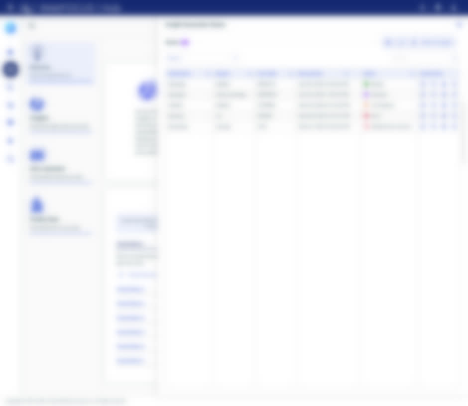
Chosen once, it binds every tab; here the same dataset carries straight into Predict Data's train-model wizard. Built, locked until release.

Four iterations
to land it.
V1 too dense. V2 too passive. V3 competed with the global Hub navigation. V4 landed: an outcome-described engine nav and a first-run page that teaches instead of intimidates.
The dense first draft, and the version that landed.
The first Discover page, and the one that shipped. V1 crammed a global search bar, preferred-data-source cards, and auto-generated data stories onto a single screen — too dense to parse. V4 stripped it back to an outcome-described engine nav, three clean tabs, and a first-run page that teaches instead of intimidates.
Three dead ends, and the one that landed.
V1 crammed a global search bar, preferred-data-source cards, and auto-generated data stories onto a single page — too dense to parse. V2 overcorrected into a passive explainer. V3's heavy “Get Started” side drawer competed with the global Hub navigation it was supposed to live inside. V4 landed: a calm engine nav down the left, three clean tabs, and a page whose job is to get you moving.
Three dead ends, in the actual pixels.
The wrong turns at full fidelity — before V4, the Discover page below, finally landed.
Outcome first.
Tool names never.
The engines shown as scannable, outcome-described entries — each one says what it does for you, wrapped in a “What are…?” explainer that takes the fear out of AI. Describe your goal; the hub routes you to the engine.
Uncover hidden gems and fascinating trends in your data with ease. Select your data, hit “generate insights,” and watch meaningful visualizations come to life — helping you spot trends, patterns, and key findings you might have missed. No data expertise needed.
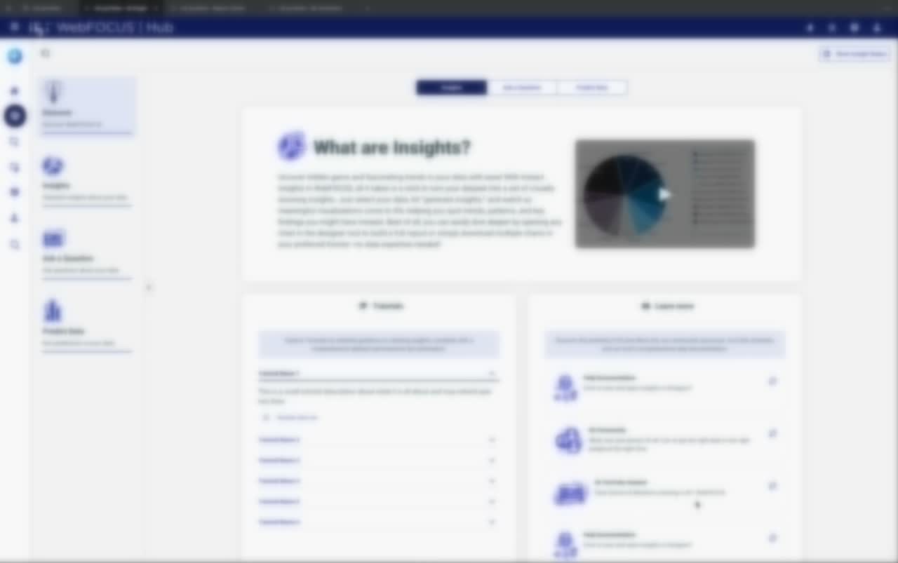
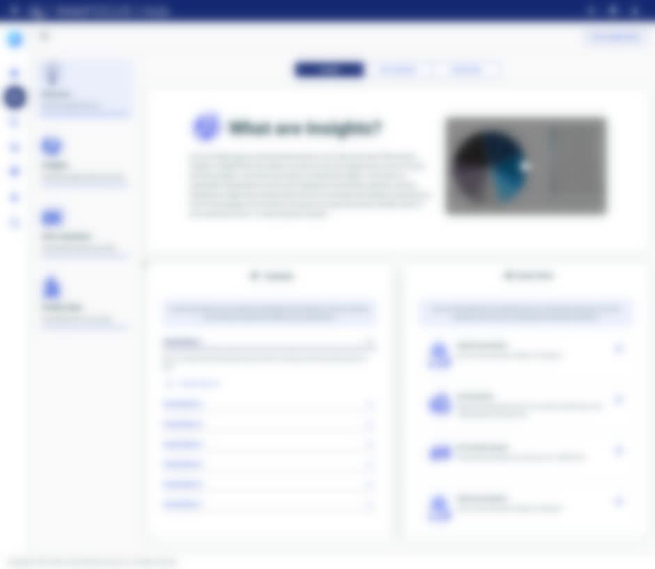
The landed Discover page — outcome-described engines, not a list of technical tool names. Each engine says what it does for you, a “What are…?” explainer removes the fear of AI, and Tutorials + Learn-more turn the empty first screen into a place to start. This is the version that made the invisible findable.
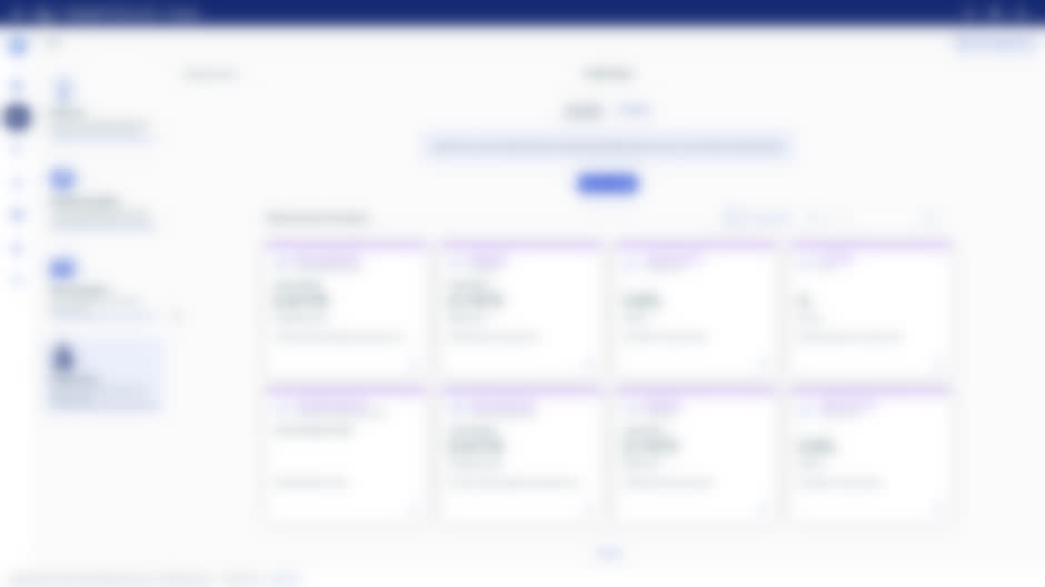
The real Discover page, shown blurred.
The engine nav down the left, the outcome-described “What are…?” explainer, and the Tutorials and Learn-more panels — the same page, one tab per engine.

I defended tiles against
veteran architects.
Nearly everyone I worked with had been there for 20 to 30 years. The lead architect and the WebFOCUS architect wanted traditional list views. I showed that list views were the exact reason these features were invisible, and backed large, outcome-described tiles with user evidence and industry precedent. Then the tutorials: a cross-origin wall stopped the docs from loading in-app. Rather than drop the guided layer, I designed a one-click “Install Tutorials” opt-in, and we stood up a proxy to stream them in.
Newest in a room of veterans. Won it with evidence.
Nearly everyone I worked with had been there for 20 to 30 years. The lead architect and the WebFOCUS architect pushed hard for traditional list views. I demonstrated that list views were the exact reason these features were invisible — and shifted their mental model toward large, outcome-described tiles that give immediate context to intimidating AI, using industry precedent and interaction logic. Despite being the newest person in the room, I backed the architecture with user evidence; my director handed me the reins and mentored me, and I drove the integration.
The last fight was the tutorials. The legacy install path was hostile, and the docs wouldn't render — a cross-origin wall stopped the tutorial PDFs from loading into the in-app sidebar. Rather than drop the guided layer, I designed a one-click “Install Tutorials” opt-in, and we stood up a CORS middle-tier proxy to stream the PDFs into the iframe. The Tutorials and Learn-more panels on the Discover page above are what that fight bought.
The engines didn't change.
The architecture did.
I didn't add capabilities or rewrite a single engine. I gave three powerful, invisible tools one home — high-leverage work: no new features, just making powerful tools findable.
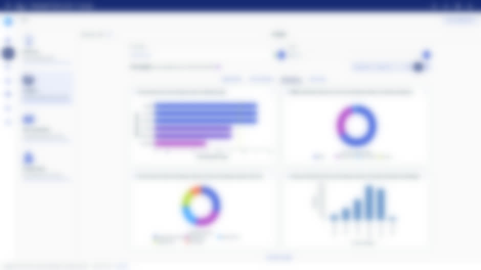
Three engines, one place. The real hub — design done.
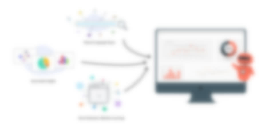
Natural Language Query, automated Insights, and machine learning, unified under a single plugin.


“Anuja is a standout design leader who brings clarity, collaboration, and strategic impact to every project.”
The work was done. Budget cuts held the release.
My design was complete and handed off when the November 2025 layoffs and budget cuts shelved the release, and priorities shifted toward retaining existing clients over attracting new ones. So it didn't ship. But the work stands: the architecture and every screen. The engines' own wins landed on their own timelines — the NLQ redesign, automated Insights, and the ML workflow each shipped or matured separately. IQ's contribution isn't a new feature; it's the architecture that turned three invisible tools into one product you can actually find your way through.
“Anuja consistently demonstrated a deep understanding of user-centered design and the ability to translate complex product requirements into intuitive and visually engaging experiences.”
“What sets her apart is her empathy and cross-functional fluency — she listens deeply, challenges with purpose, and quickly earned the trust of stakeholders at all levels.”
What I'd push harder forThe guided layer, earlier
I proposed a dedicated “Get Started” panel up front; through iteration I improved the tutorials, the Discover page, and the Explore-Data header instead — better UX, same goal. I'd fight for the guided layer from week one next time.
What I'd do nextEcosystem integration
Connect ReportCaster and IQ to auto-schedule generated insights, and turn Ask a Question into a chat interface for the entire platform.
Not more features.
One architecture.
High-leverage work: no new features, just making powerful tools findable.